Diva Confectionary
Diva Confeitaria is a new brand on the market specialized in pies, cakes, puddings and more. In addition to the taste of the desserts, the confectionery also values an impeccable presentation. With the visual identity, the brand aims to reach the popular public in a friendly and inviting way.
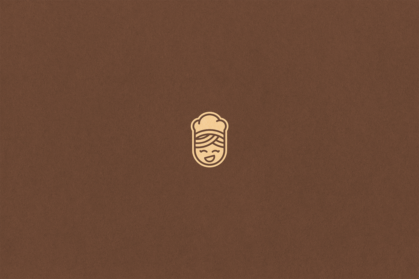
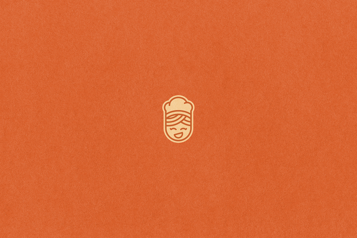
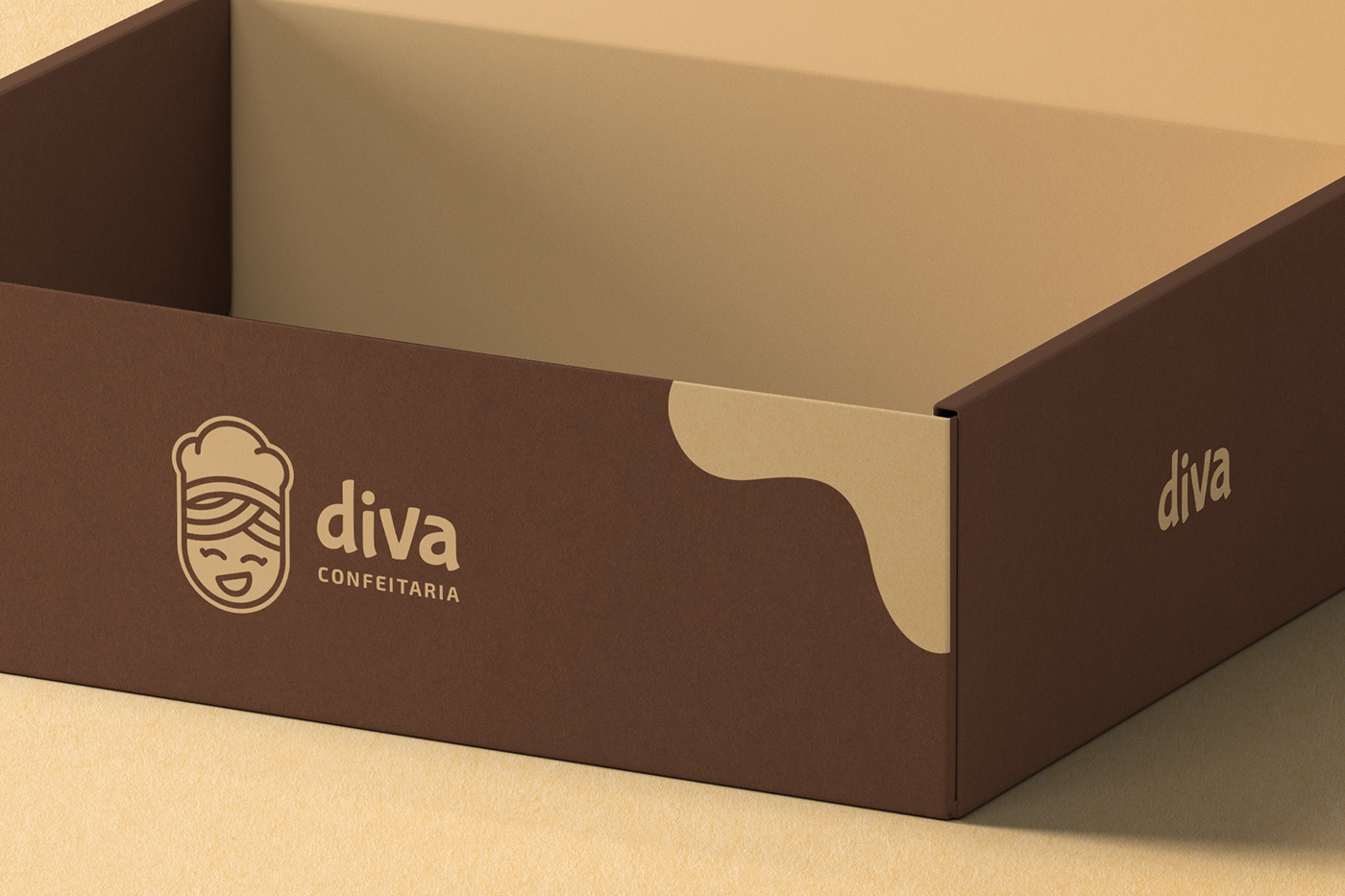
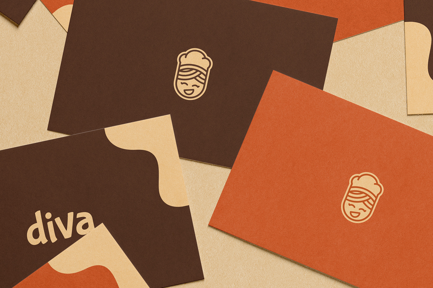
The inspiration came through representing the business owner in a young way and in a drawing, the character is smiling with her eyes and mouth, giving the consumer a feeling of charisma and love for what she does.
Colors and Typography
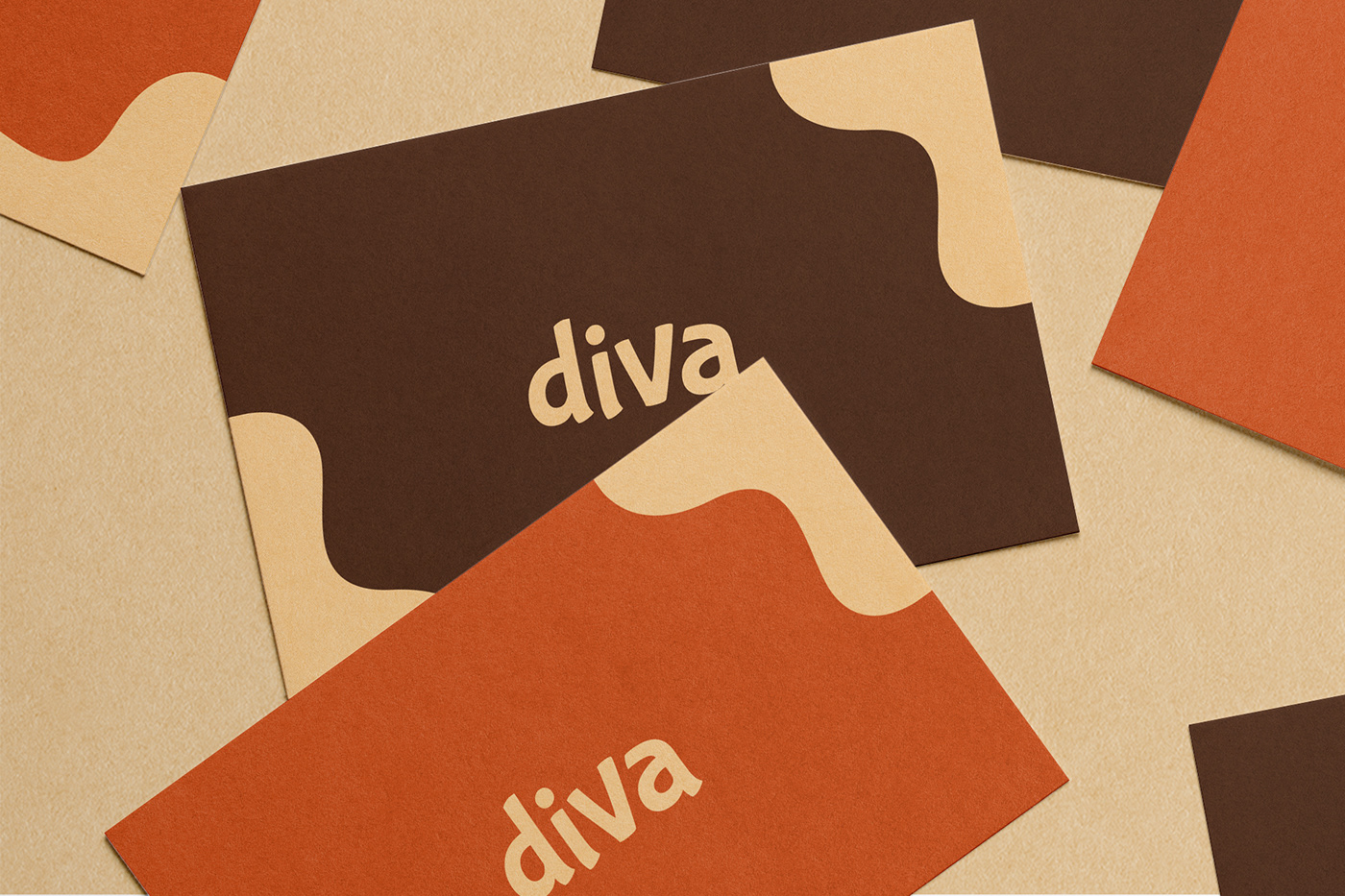
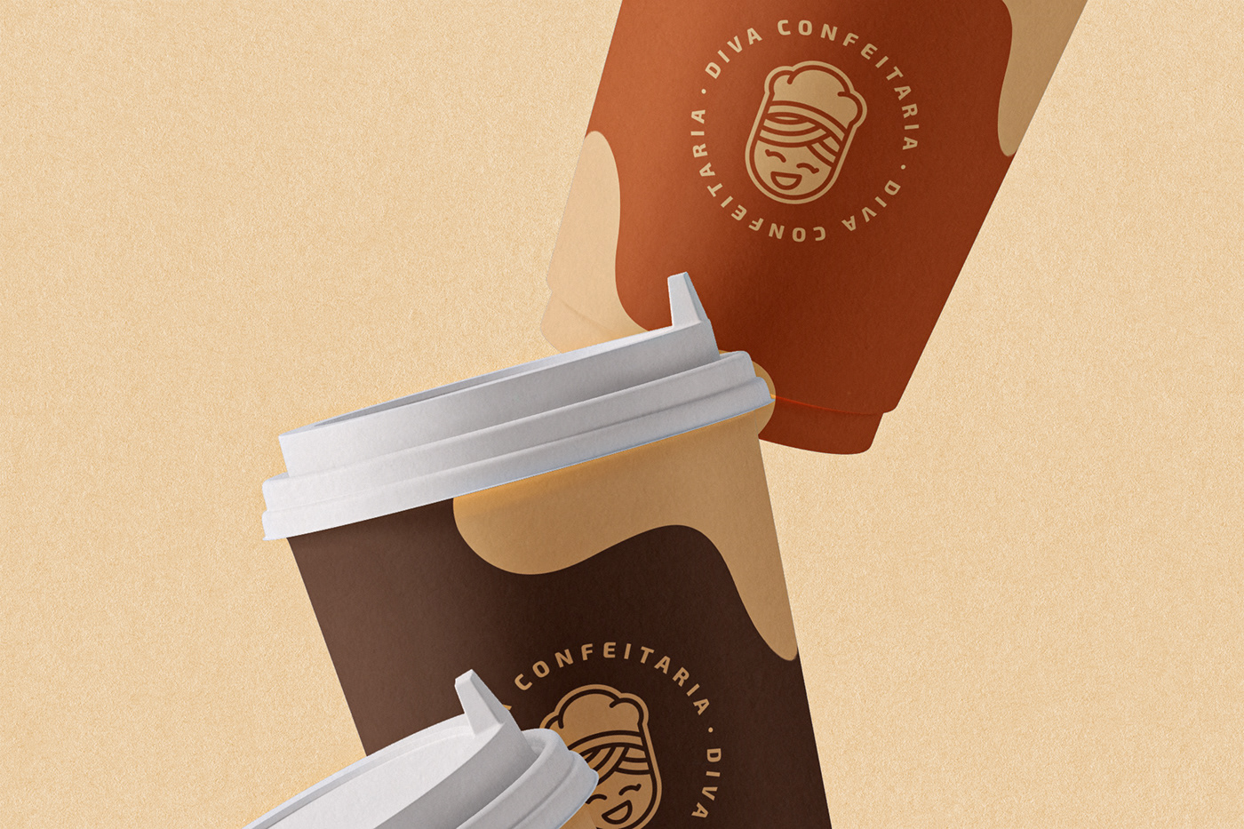
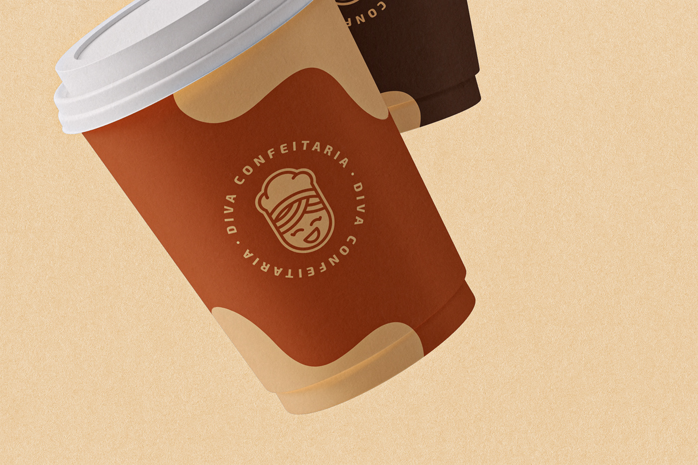
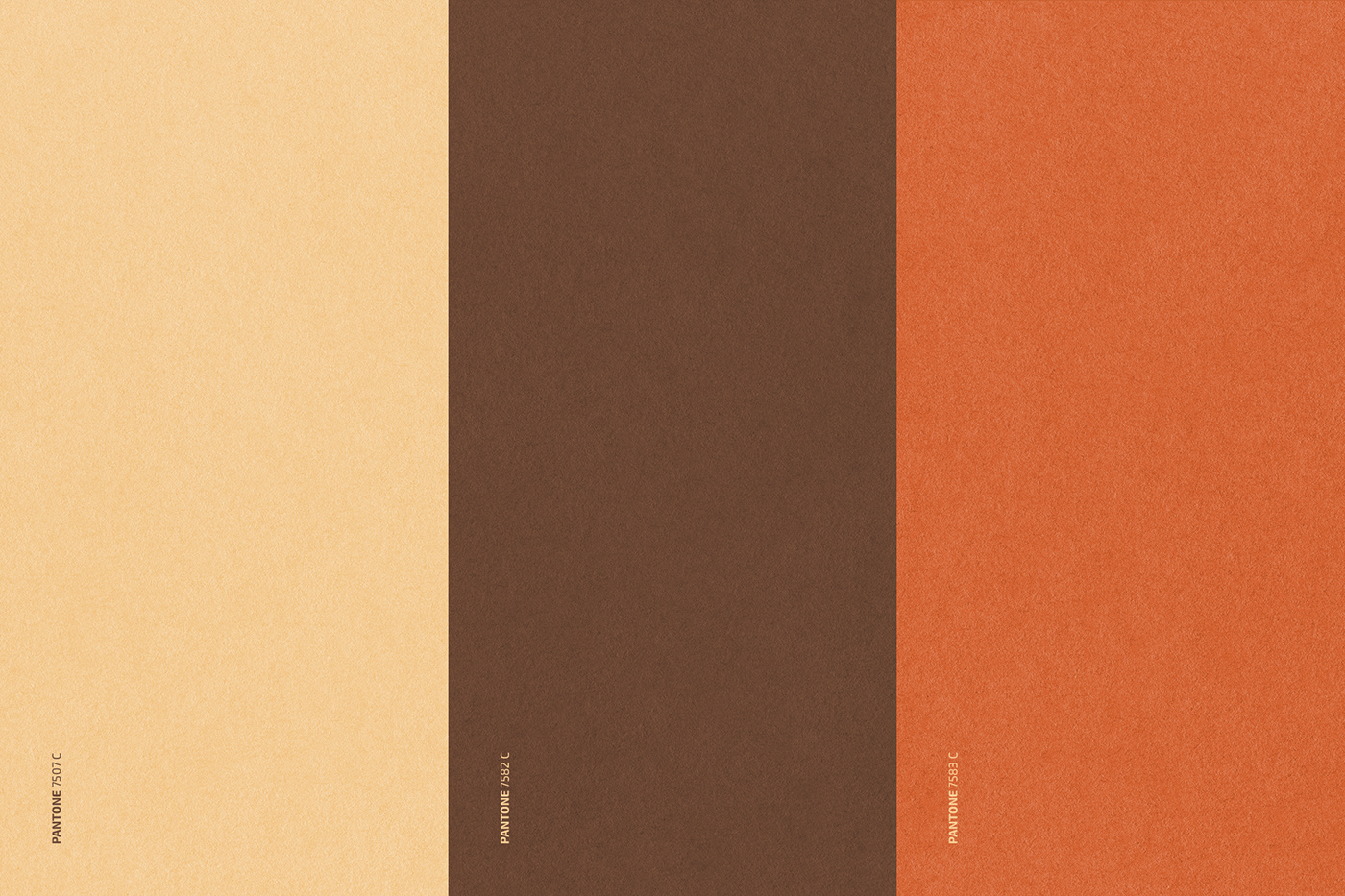
The colors used in this visual identity were based on tones that resemble chocolate, such as brown, reminiscent of milk chocolate, cream, reminiscent of white or vanilla chocolate and orange that makes a good combination with the other two colors.
Two typographies were used, the main one being Bubblegum Sans, which is considered a display font and conveys the human, accessible and friendly feeling. The support typography used was Exo 2, which is considered Transitional / Neo-Grotesque and creates a good contrast with the main typography.

Pattern
The pattern used in the visual identity is a kind of chocolate drops that when in contact with some surface turned into chocolate stains and were used to represent the icing on the cake, cupcakes, pies, among others.